CARTER & CONE
Producing type for bold face names like Time, Newsweek, Wired, The Washington Post, The New York Times, the Museum of Modern Art, and Yale University, among many others, Matthew Carter and Carter & Cone need no introduction.
When Carter & Cone became a part of The Type Founders we were able to provide the business and operational backbone that allowed them to concentrate on what they loved most: their craft.
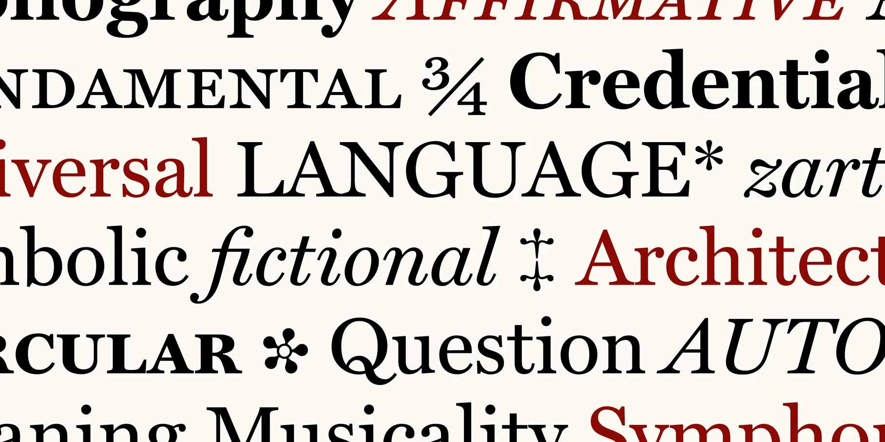
Together, we were able to help them take their font, Richmond CC, initially commissioned for a major daily British newspaper redesign, and expand into a complete family with contributions from Jill Pichotta and Richard Lipton of The Type Founders. The typeface was enriched with a broader range of weights and styles it would not have achieved independently. The Miller Banner family was also expanded, with four new widths — Extra Compressed, Compressed, Extra Condensed, and Condensed — all in five weights with true italics, making it suitable for luxury branding, fashion magazines, and newspaper headlines.
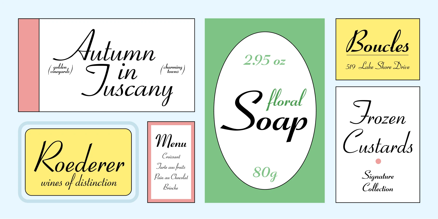
What’s more, The Type Founders has elevated Carter & Cone’s visibility and reach across the industry. For instance, when Taylor Swift chose Big Caslon for the branding of her album The Tortured Poets Department, we amplified the cultural moment and made sure the design community knew that, once again, Carter & Cone, had impacted culture like only they can.
They’re perfect examples of how The Type Founders’ team has been able to supplement Carter & Cone’s design output, helping the foundry bring more complete and commercially viable type families to the world.