Over 40 foundries now call The Type Founders home. Our stewardship of these foundries and our support for the type designers who create collections of typefaces are things we take pride in. Our brand was not showcasing this stewardship, nor adequately highlighting our active foundries and new releases. Overdue for a new look, we set out to craft a new brand for ourselves.
![]()
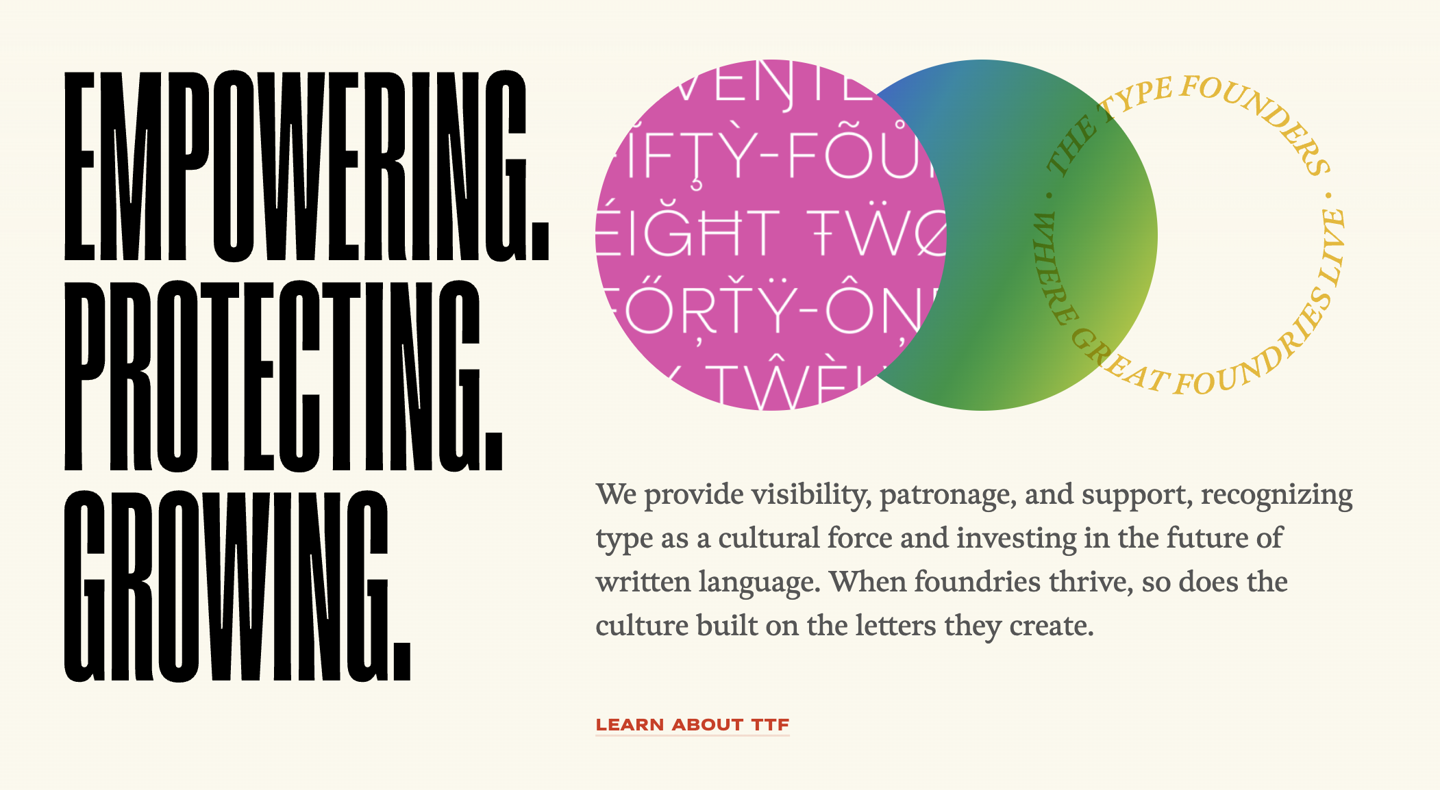
The new mark is designed to hold up in passing at conferences and on foundry site footers alongside foundry branding. We landed on using ATF Super Condensed stacked in a square, with a circular logo as a distinguishing stamp. The logo mark consists of the letters “TTF” intertwined and abstracted into a circular stamp of quality.
Our type choices include two grotesks to handle a range of widths: ATF Super Condensed for condensed and Grtsk from Black Foundry for expanded. These grotesques are paired with Meno from Lipton Letter Design to add a more expressive character. These type choices give us broad design flexibility and enable us to create more complex and compelling type hierarchies.
Putting foundries first
Our foundry partners are the bedrock of our business. Using our new brand to highlight them was at the heart of every decision we made. The mark itself can serve as a window to view foundry work, and the logo lockup can change to highlight a partner. We also worked to create a brand that would work with any color palette, ensuring it would feel at home in our foundry partners’ color schemes.
Our past, present, and future
We are the caretakers, and this rebrand helps us elevate their work. Our new blog, World of Type, highlights the work our foundry partners have put into new typefaces, and it will also be used to reveal the work our team puts into the production, release, promotion, and stewardship of these efforts. This rebrand doesn’t signal a change to come; it helps us highlight the changes the company has already undergone and enables us to build for the future.