Every year, the design blogosphere publishes plenty of lists about current typography trends. This year, the range feels enormous. Certainly too wide to define. If you look through work from 2026 on Fonts In Use, you’ll see combinations from traditional to the seemingly off balance. Bookish typefaces become enormous headlines. Elaborate, maximalist choices coexist with irregular serifs. Typefaces that don't seem to go together at first end up looking entirely appropriate when paired.
There is an abundance of expressive type, type that evokes emotion, type that feels right for the words, the images, the format… for the context. Type that seems to surpass any tidy list of dominant trends.
The biggest typography trends in 2026
No single style has defined 2026 so far. But some ideas keep recurring. Expressive type is being used with confidence. Restrained, almost basic, type is too. Familiar typefaces are showing up in unfamiliar places, and combinations don’t always depend on obvious stylistic harmony or make immediate sense. The incongruity invites us to immerse ourselves in the content. To understand the choices. Contradictory pairings might not be new, but they are showing up often enough — and in enough different kinds of work — to be worth paying attention to.
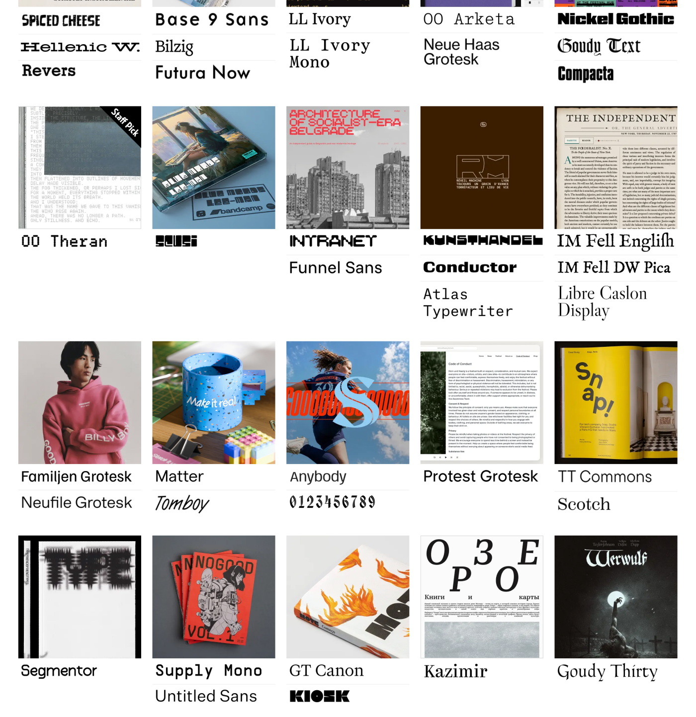 A small selection of the many projects from 2026 as seen on Fonts In Use. All rights reserved.
A few other trends worth naming:
- Unexpected roles. Bookish, text-oriented, or otherwise familiar type used at surprising scales or for jobs we don’t immediately associate with it.
- Contrast in character. Maximalist or highly expressive type living alongside pragmatic type; combinations that are less about obvious harmony and more about the overall composition.
- More type as logo. Forgoing the use of a custom logo (or mark) in favor of using typefaces with strong typographic flavor as logotypes.
- Variable fonts. As the technology improves and type designers continue experimenting, this format is being used more often for both creative and performance reasons.
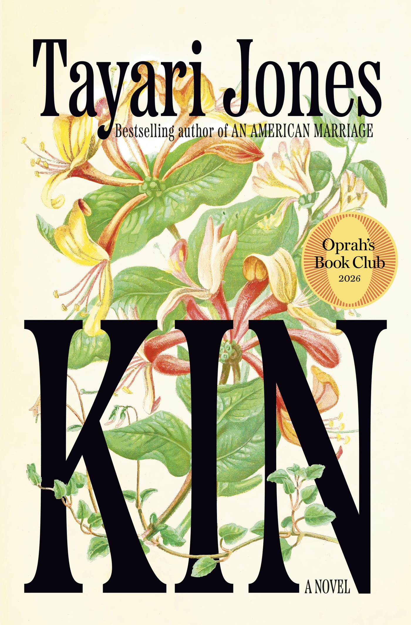 Kin book cover designed by John Gall using Etna from Mark Simonson Studio. All rights reserved.
Trying to define modern typography trends
So what makes modern typography feel, well, modern? It isn’t necessarily a modern-looking typeface. Some of the most contemporary work uses ideas and fonts that are considered plain on their own, but puts them in unexpectedly successful situations. For example, a typeface associated with books becomes a display face on flour packaging. Or something refined gets combined with something expressive, and both sit next to something deliberately ordinary.
What feels contemporary is often the treatment: scale, spacing, contrast, composition, and the relationship between different kinds of type. Familiar ingredients can produce unfamiliar results.
 Equip rebrand by Wedge using Mackinac from P22 Type Foundry. All rights reserved.
Contradiction is part of what makes some current typography interesting. Typography can be bold and elevated at the same time. A highly mannered display face can sit with a pragmatic sans serif. Typefaces don’t always need an obvious formal relationship to work together. The contrast between them is what gives the typography its energy.
Of course, none of these ideas are new. Typography has always borrowed and recombined old ideas for new jobs. What’s worth paying attention to is the particular mix and the range of approaches that can feel modern at the same time.
Web design typography trends — no longer static
Typography on the web never really holds still. The words may stay the same, but the space around them changes constantly. Type has to work on different screen sizes, proportions, reading conditions, and content length. Good web typography has always dealt with these constraints, but designers now have more ways to make the type itself respond to them.
Variable fonts add another dimension to that flexibility. Weight, width, optical size, and other characteristics can become responsive options rather than fixed styles. This can make for dramatic effects and animation, but some of the more interesting possibilities are quieter: allowing the type to adjust as the space available changes.
Web design also allows type to take up space in different ways. Assertive hierarchies with large, full-width headlines and smaller text with shorter line lengths create pages where the typography carries much of the visual identity. Type doesn’t always need an image behind it to make a page feel designed.
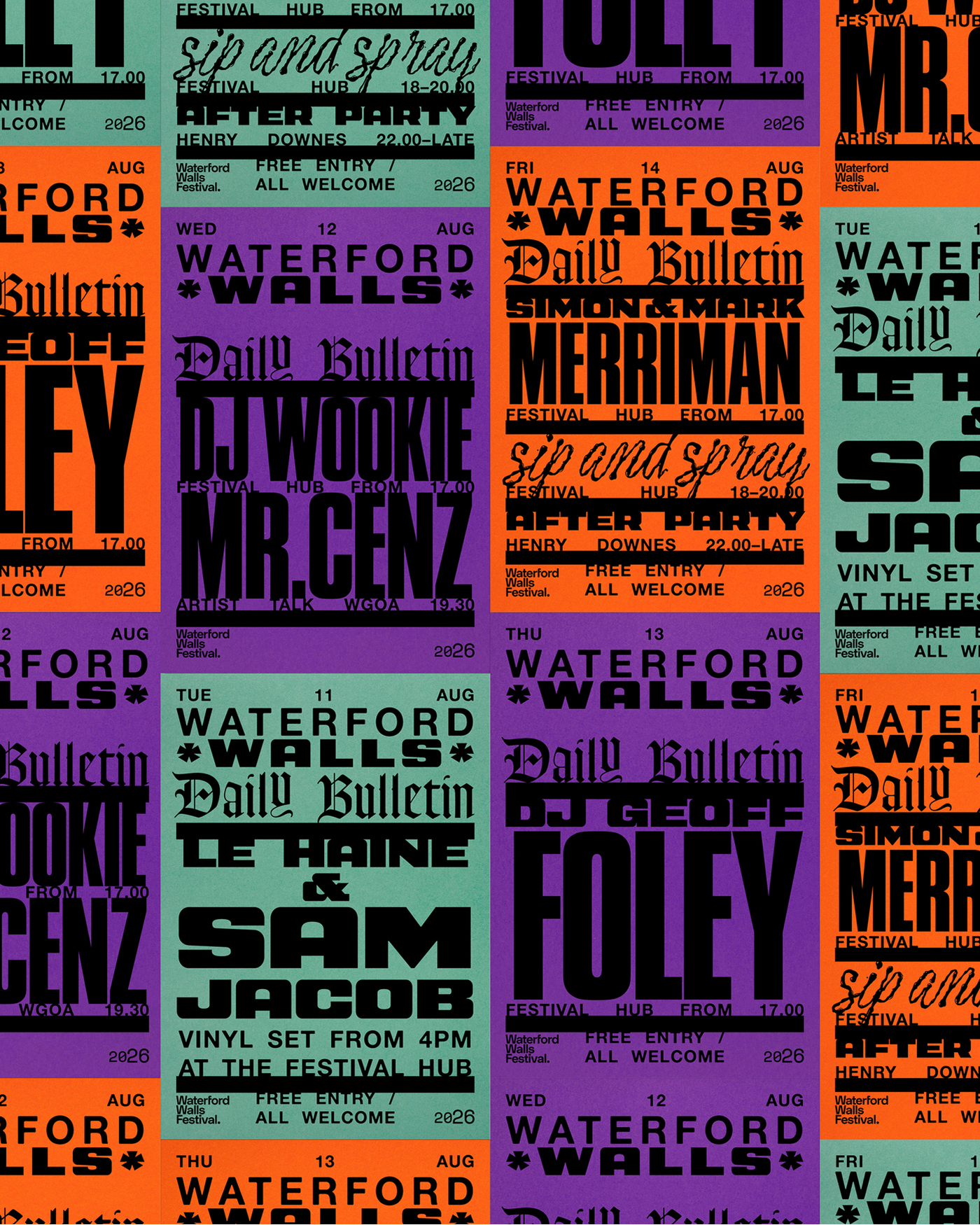 Waterford Walls Daily Bulletin designed by Steve O Connell studio using Goudy Text from Lanston Type Company. All rights reserved.
Logo and branding typography trends — it’s about moderation
Type has always been central to branding, but current identity work shows just how many ways typography can create a recognizable voice. Sometimes that comes from a distinctive display typeface or custom lettering. It can also come from an otherwise pragmatic font used consistently and with conviction. Scale, spacing, hierarchy, and repetition can be as important to a brand’s typographic identity as the letterforms themselves.
Expressive type also doesn’t have to carry an entire identity on its own. A character-rich display face can sit alongside something much more practical. One gets to be loud because the other doesn’t compete with it. The contrast becomes part of the identity.
A logo doesn't necessarily have to contain all of a brand’s personality, either. The larger typographic system has many opportunities to establish character — headlines, packaging, navigation, captions, campaigns, and all the repeated moments where people encounter the brand. A restrained logo can live inside an expressive typographic system, and a distinctive logo can be supported by deliberately quiet type.
 Pivot Point Physio designed by Planet People Studio using Roca from My Creative Land. All rights reserved.
Variable and kinetic type trends — subtle counts too
There’s more motion in typography right now. Web pages get to come alive when the context calls for it, and type is naturally part of that. Headlines stretch, contract, scroll, rotate, respond to interaction, or change as you move through a page. The movement communicates something, directs attention, or simply adds energy or delight.
Variable fonts give designers even more ways to work with motion. Instead of moving a static word around the screen, the letterforms themselves can change — shifting in weight, width, slant, or other characteristics.
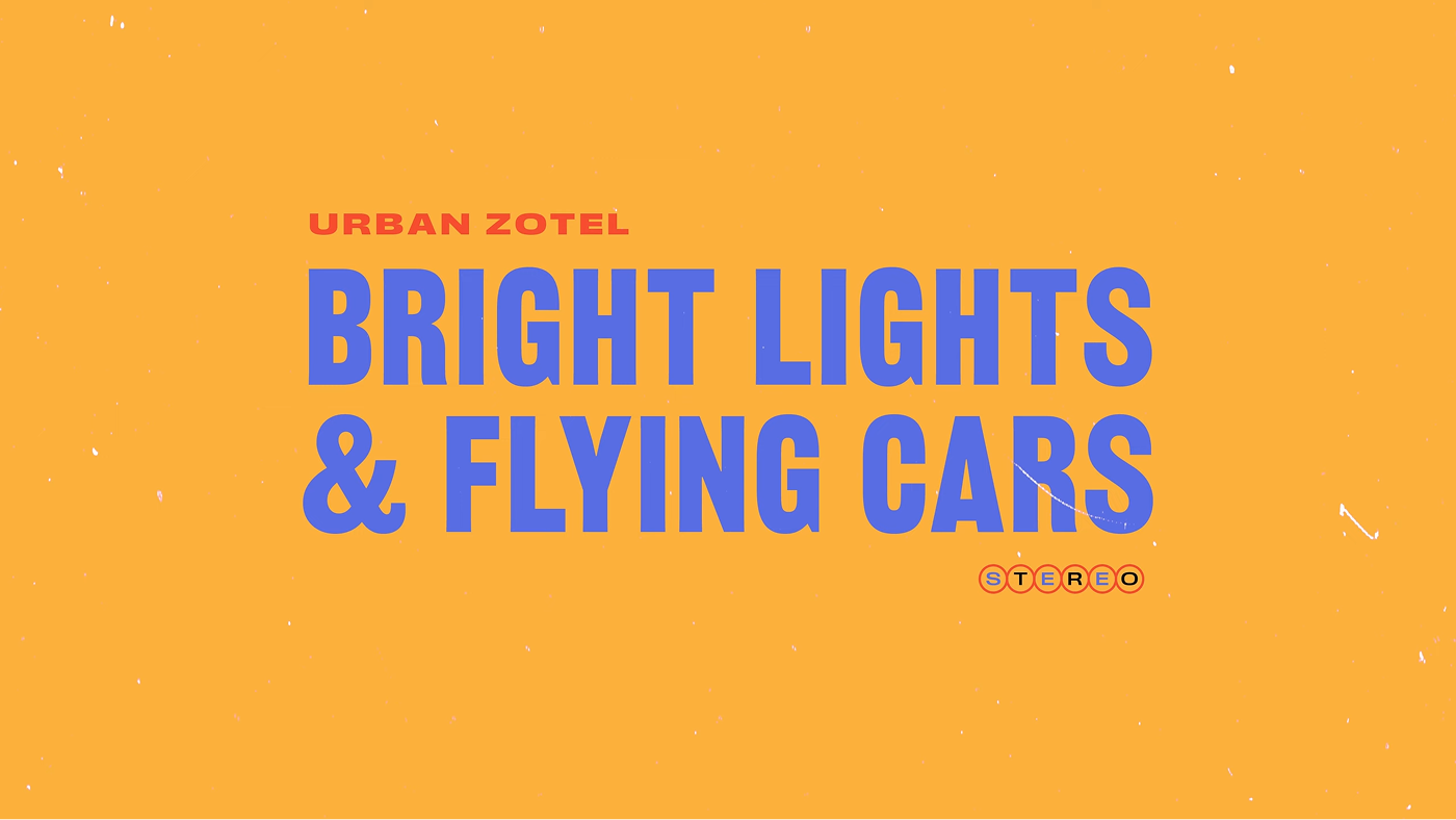 Bright Lights & Flying Cars music video for Urban Zotel using Railroad Gothic from American Type Founders. Watch the video on YouTube. All rights reserved.
Kinetic typography doesn’t depend on variable fonts, and motion doesn’t need to be dramatic to matter. Subtle movement can be as appropriate as a headline that bounces to life and takes over the screen. What feels current is the range and the willingness to let typography move when movement adds something to the experience.
Where to find trending typography fonts
Finding contemporary typography means paying attention to both how type is used and what type designers are making. New font releases are a useful signal. Type designers follow trends, respond to one another, revisit historical sources, and introduce their own ideas. Following type foundries and their new releases can give you a sense of what is happening in type before you encounter them being used repeatedly in finished work.
Look at what designers do with those typefaces. Fonts In Use is particularly useful because it documents type in context. Don’t only notice which typefaces appear. Pay attention to what jobs they’re doing: their scale, spacing, hierarchy, companions, and relationship to the rest of the composition. An unassuming typeface can become surprising through use, and an expressive new release might end up doing a job you didn’t expect.
Try the type yourself. Trends can show you where to look, but setting type is how you learn what it can actually do. Put new releases into real words and layouts, alongside type you already know. Try unexpected roles and combinations. Pay attention to what you discover, practice it, and set your own trends.
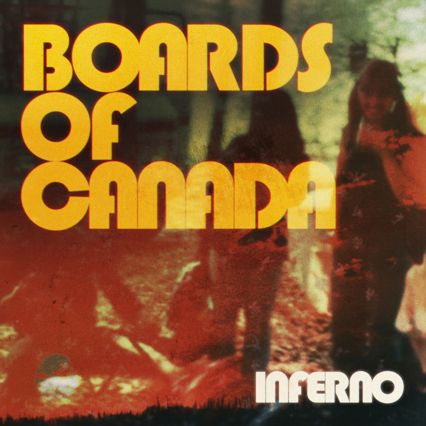 Boards of Canada album art designed by Marcus Eoin, Michael Sandison, and Boards of Canada using Blippo from Mecanorma. All rights reserved.
FAQs:
Q: Is there one typography trend that defines 2026?
A: Not exactly. What stands out this year is the range of use. Traditional mixed with unconventional, maximalist next to plain, combinations that don’t share an obvious connection but still feel right together. If anything’s driving that range, it’s appropriateness for the context.
Q: What are the biggest recurring typography ideas in 2026?
A: A few themes keep showing up across different kinds of work: unexpected roles (bookish or text-oriented type used at surprising scales), contrast in character (expressive type paired with deliberately pragmatic type), more type as logo (typefaces doing the work of a logotype), and variable fonts being used more often for both creative and performance reasons.
Q: What makes typography feel “modern” right now — if it’s not about using a modern-looking typeface?
A: A lot of contemporary work uses letterforms with long histories, but applies them in unexpected ways. What feels current is often the treatment: scale, spacing, contrast, composition, and the relationship between different kinds of type — especially when contrast (not obvious harmony) is what gives the typography its energy.
Q: Where should I look to understand what’s trending in typography (and why it works)?
A: Pay attention to both what type designers are making and how designers are actually using it. New releases from foundries are a useful signal, and Fonts In Use is especially helpful for seeing type in context. Don’t only notice which typefaces appear — look at what jobs they’re doing: scale, spacing, hierarchy, companions, and how they sit in the overall composition.